A small diversion from my usual posts this one is actually a review of the new Luftwaffe Camouflage colors from AK Interactive.
As many readers seems to be modelers and this blog deals a lot with the topic of Luftwaffe camouflage it seems logical to take a look at this from a modelers point of view.
The set "AK2001 Luftwaffe Camouflages 1" contains 8 bottles of acrylic paint that according to the label has been done to take the scale effect into account. The colors included are 02, 65, 66, 70, 71, 74, 75 and 76.
Accuracy
As the colors are done with scale effect taken into account I won't compare the colors to colorcharts from the likes of Ullmann, Kiroff or Merrick but rather concentrating on how they look together I sprayed each color except RLM 66 onto a square inch of matt photo paper so that I could photograph them side by side. My first impression was that the RLM 65 was looking nice and bright which would make for good contrast with the upper colors. I also noticed that RLM 71 was a bit too bright making it look a little pale in both a 71/02 scheme as well as a 70/71 scheme. RLM 75 is a bit dark and losing all contrast against the RLM 74.
To solve the problem with RLM 71 I simply mixed it with RLM 70 at a ratio of 50/50 and achieved something that looked a lot better to my eye. The dark RLM 75 could be equally easy solved by adding a bit of RLM 76 to it. The colors can be seen below including my own 50/50 mix of RLM 70 and RLM 71.
 | |
| Note:There's countless ways for these photos to not display properly on your monitor so they're to be considered a rough guide at the most |
Spraying
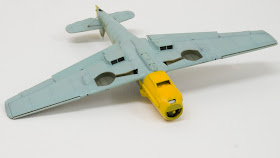
As I had an Eduard 1/48 Bf109E ready for paint I decided to try these colors on to get a better idea of how they work. I sprayed the RLM 65 thinned with Ultimate Thinner and it worked nicely and covered well despite the bright nature of the paint. During further trials I couldn't get quite a good consistency for detail work when I thinned the paint with Ultimate Thinner. I then tried ammonia based window cleaner which seemed to work great at first but led to trouble with color separation.
Finally, a quick round of Google showed that Tamiya acrylic thinner should work well with AK Interactive colors. I tried it and it worked great! I thinned the colors heavily and sprayed everything but the main wing splinter pattern freehand. For RLM 71 I used my 50/50 mix and it looked great.
There can still be a few issues with clogging if the needle isn't perfectly clean but overall I think it worked great. The result can be seen below. There's no weathering except for pre-shading. I think it's worth noticing how even the satin sheen of the colors is, even though it's sprayed with various thickness for the pre-shade to work. The RLM 04 is Xtracrylix by the way.
Conclusion
These colors are really nice and the problems noted can be fixed by using other colors in the set so there's no need to buy other colors to use for mixing. I only hope that AK Interactive will consider selling these colors as individual bottles as well as in set because I'm quite sure I'll run out of RLM 65 long before the other colors in the set.
Thanks to AK Interactive for the review sample.


Thank you for reviewing these! I have wondered how they look. You did a great review. I would love to see how the 74/75 come out on a plane with any fixes you make to the 75. I too wish these were sold individually as well.
ReplyDeleteThanks,
Aaron
Hello Anders,
ReplyDeleteI always liked the famous "scale down effect"; truly.
A colour picture sized 10x15 of your favorite subject is scale downed; isn't it?
Then, can you see any "scale down effect" on it?.. No.
What about "scale down effect" on black or on white, red ...?
What about the contrast you're loosing or , by the contrary you're enhancing?
...
For me it has always been a "mode effect" started at the end of the 60's by the Anlo-Saxon littérature with many afterwards followers ... from 10% to 25% to the most extremists.
Quite an example where "terrorists" won the war!
Best regards, Franck.
I think you're missing the point Franck, scale effect isn't about size as such. The idea is that a model in a certain scale represents the real thing seen at a certain distance. There's no doubt that colors when seen from a distance look washed out due to among other things moisture in the air.
ReplyDeleteI'm not that concerned with the theory myself, I want colors that simply look good together and gives a believable contrast.
If if does, it's good enough for me, regardless of any theories. :)
Cheers! / Anders